Categories
Posts

Clearfix Clarity

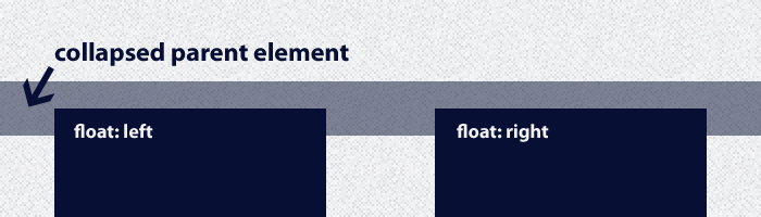
When helping other designers and developers who are learning, the same basic issues come up quite often. One question that always seems to come up is the dreaded Float Collapse. Simply, the parent element will collapse and have no height if the child elements are all floated. Most of the time it isn’t noticeable, although you will notice when you want a background image on the parent element to be visible.

Float Collapse Issue Image

I am not going to explain how floats work, it is summed up very well by CSS Tricks. I am instead going to explain scenarios I was doing that just were over complicating a simple issue and show how I do things now. This post is primarily for referring people who are having the same issue, I often see people making the same mistakes.

When working with the Thematic Framework for WordPress I would run into the issue of float collapse while working with background images sliced from PSD’s. Fixing that is easy, the are multiple ways to do it, often a overflow: hidden; will fix it, but sometimes you need the good ole trusty CSS “clearfix”.

The CSS to make it work.

The CSS for the clearfix is simple, I usually choose to use the micro clearfix hack created by Nicolas Gallagher.


.cf:before, .cf:after { content: " ";  display: table; }
.cf:after { clear: both; }
.cf { *zoom: 1; }

The CSS above makes it seem like you have to add a class to perform the clearfix, so all you have to do is add a class of .cf and boom fixed!

Well…. the key is you don’t have to add a class or any additional HTML markup at all. The goal is to not add anything to the HTML markup that isn’t required, especially something in the styling realm like a CSS clearfix.

Friends don’t let friends clearfix like this.

A long time ago I decided I would use jQuery to add the class of .cf to the parent sections that needed it, simple.


jQuery("#main").addClass('cf');

The problem is this relies on jQuery and it takes a little time to load so there would be a flash of unstyled content, albeit most of the time it was barely noticeable, it still bugged me.

Instead of using jQuery, I opted to go the route of adding the .cf class to the sections where needed.


<div id="main" class="cf"></div>

Or if not possible, adding a completely new element with a clearing class, clear: both; to essentially clear the floats which also works to remedy the float collapse.


<br class="clear">

While better in terms of performance, fixing the FOUC, this was now polluting the structure of the actual HTML site with unneeded markup.

How I clearfix now.

I will be the first to admit, I felt pretty stupid when I figured out there is no need to add a new class at all. Instead, just change the CSS on the clearfix to the existing ID/class.


#main:before, #main:after { content: " ";  display: table; }
#main:after { clear: both; }
#main { *zoom: 1; }

Much better and no need to add additional markup to the HTML structure.

If you are a bad ass and use Sass/Compass in your working environment, it is even easier to add letting the preprocessor handle the output.


#main { @include pie-clearfix; }

So hopefully I never see you using another clearfix class in the actual HTML again. This same thing of not adding unnecessary classes applies to grid frameworks, in the same exact way, but that is another blog post.

Categories
Posts

Titanic, a child theme for Thematic

The Titanic child theme is my last real attempt at creating a full fledged theme for the Thematic Theme Framework. This is the responsive child theme my site is currently built on, so technically you are looking at the demo right now. This is yet another theme built on my own Responsive Base which is a starter child theme for Thematic aimed at speeding up development times.

Titanic Responsive Theme Example Image

Demo Titanic Theme

Download Titanic Theme

Titanic Highlights

This responsive theme is packed with best practices involving developing child themes for Thematic I have picked up in the past few years. The one thing that makes this theme stand out is the way the menu works, it uses a footer anchor approach which is not currently set up for drop downs.

The theme is also built on Sass and Compass which hopefully you are using as it will make developing sites quicker, even if you just use it for the ability to import and compile.

While creating this theme, I made my best effort to make it compatible with the new Thematic HTML5 Plugin created by Karin Taliga. This plugin is awesome for converting some existing elements in Thematic to HTML5 without losing any functionality. For anyone that has looked into this (me), it is a pain to do and she has done an amazing job.

If you want to know every detail about this theme, you will probably want to review the information on my Responsive Base theme since they share all the same features.

Categories
Posts

Child’s Play, child theme for Thematic

Child’s Play is a child theme for the Thematic Theme Framework, it is built with the mobile-first approach to responsive web design, but with a few unique features. It was originally created as a stress test for the Responsive Base to find more improvements and make sure I wasn’t forgetting anything obvious. After adding new functionality and some styling to make it a little more visually impressive, the Child’s Play child theme was born.

Child's Play Responsive Theme Image

Demo Child’s Play Theme

Download Child’s Play

This project is on Github, so feel free to contribute!

Child’s Play Highlights

While this child theme shares all the same benefits as the Responsive Base child theme, I won’t be repeating them here. Child’s Play is unique in that it is the only child theme (I know of) available for Thematic which has the benefit of using Sass and Compass. Child’s Play turned out to be a good alternative to Responsive Base for those who want even a more refined starting point for child theme development. Although if you were coding a site from a PSD, Responsive Base would probably be a better start.

The CSS

Child’s Play takes it up a notch adding presentational styles and utilizing some very handy features that using Sass and Compass provide. I can’t really dive into all the things that make Sass and Compass great, that is already heavily documented and there is no way I could ever do it justice. All I can say is from now on, I will always be using Sass and Compass for my future projects, I think you should too.

The Functions PHP

Probably a little over the top, the functions.php clocks in at a little over 500 lines of code. I ended up reworking a bunch of things and adding more options to be reused in other various projects.

  • Added WooThemes Flexslider which works off of sticky posts, it is currently set up to show featured images of 750px wide by 425px height, which can easily be changed. You just have to settle on a specific size and make sure they are saved as the same size when using this option. If you have no sticky posts, the slider just won’t show, and best of all, the slider assets won’t load.
  • I also went ahead and added a header aside widget, I use this a lot for addresses, search bars, or even social icons, which comes in handy.
  • Added a heavily modified version of FlexNav, a jQuery menu that is collapsed on mobile devices to provide more room for content, currently the menu doesn’t support drop downs now supports drop downs.
  • Modified the postheader and postfooter to offer a different style, keeping the content on top.

Last Thoughts

Again, check the Responsive Base starter theme for more information on all the features packed into this child theme, Child’s Play just takes it a step further. This theme may be a little advanced for someone just getting started with Thematic, but if you already use Thematic for all your child theming, I think you will love this setup. A lot of the work on this theme comes from a big push from myself to optimize my workflow and stay up on the latest best practices.

Update: Now made to comply to with Idiomatic-CSS guidelines.

Update: Now works with the Thematic HTML5 Plugin by Karin at invistruct.com.

Categories
Posts

Responsive Base, a child theme for Thematic

Update: Thematic 2.0 is now in beta and available on Github, which makes this theme outdated. You can still use it since Thematic is backwards compatible, but if you want to be up to date, use Thematic 2.0 from Github and Responsive Base Plus.

Responsive Base is a child theme built on the mobile-first approach to responsive web design. It was created not to just be responsive, but to act as a template or starting point for child theme development for the Thematic Theme Framework.

After creating quite a few Thematic based sites, I felt I needed a solid base starting point which saves a little time by being already set up with some very useful modifications I frequently use.

Responsive Base is ideal for me, I created it for me. Although others working with responsive themes for Thematic will find it useful and refreshing. It is intended to work best with the latest version of Thematic, but works fine on 9.7.7 and above.

Responsive Base Theme Image

Demo Responsive Base Theme

Download Responsive Base Theme

View the demo to take a peek, or visit GitHub to download or view the code. Special thanks to Kathy for inspiration from her adaptive layouts for Thematic.

Responsive Base Highlights

The CSS

Thematic has a great minimalistic style by default, but I prefer not to have those default styles at the start of every child theme.

  • The reset.css has been replaced by normalize.css which preserves the browser defaults and also corrects common browser inconsistencies.
  • Original style sheets have had a ton of the unnecessary styles removed and condensed, while also building everything with a mobile first approach to responsive web design.
  • Added HTML5Boilerplate print styles for clean printing and HTML5Boilerplate helper classes to take advantage of the latest best practices for things like clear fixes and image replacement.

The Functions PHP

  • Adds my snippet to add conditional classes for Thematic to the header to target old versions of IE. This also now adds the meta viewport for correct scaling on mobile devices. By default this responsive theme will display a static mobile version with a little CSS for IE7 and IE8 based on a post by Joni Korpi called leaving old IE behind.
  • Includes a few functions to clean up the head of the document of lines of code that are loaded by default.
  • Helps optimize script loading in WordPress by providing a template to promote good habits. Combining scripts, loading custom scripts in a custom.js file instead of on page and loading scripts in the footer unless they are required to load in the header.
  • Loads Modernizr which includes the html5shiv for getting IE to recognize new HTML5 elements, also Modernizr does a ton more, especially useful for providing CSS3 fallbacks. Responsive Base child theme comes bundled with the full version of Modernizr, you should however use the build script to only include what you need.
  • Loads FitVids JavaScript which handles the resizing of videos for responsive websites.
  • Also provides a bunch of handy functions I tend to use on most child theme builds. Such as PHP snippets to add a Favicon, register additional menus in WordPress, a fourth subsidiary widget (good for footer menus), optimized Google Analytics and also a snippet to hide widget locations in the admin area.

Responsive Base File Structure

Includes necessary folders and files already setup in the child theme to promote well structured themes.

  • /images/
  • /js/
    • custom.js
    • jquery.fitvids.js
    • modernizr.js
  • favicon.ico
  • functions.php
  • screenshot.png
  • style.css
  • style.scss (for Sass/Compass)

Last Thoughts

While this theme is intended for developers to dive right in to responsive design with Thematic, it would also help people who are new to child themes get an idea on how things can be done in a clean and efficient way. Getting started in mobile-first responsive design can be rough at first, so hopefully you find this child theme template useful and be sure to always get the latest version or fork your own from GitHub.

Feel free to post your creations with the Responsive Base child theme in the comments, or if you think of anything to add, shoot me a pull request on GitHub. :)

Update: Now made to comply to with Idiomatic-CSS guidelines and also added a style.scss file for a basic Sass structure which also follows the guidelines. If you don’t use Sass, delete the style.scss file.

Update: Now works with the Thematic HTML5 Plugin by Karin at invistruct.com.

Categories
Posts

Front-End Development and SEO on the Go

There are occasions where I am asked to check out a webpage and review ways it could be stronger. While this can be a fairly in depth process, you usually can see a lot at a quick glance and it definitely helps to have the right tools. The problem is I frequently get asked when I am not home with the comfort of all my front-end development or search engine optimization tools I have come to rely on.

Recently on a family visit that was suppose to last a few days, those days quickly turned in to a months time. It was painful to not have all my tools available that I use daily. That is when I recalled reading a article about creating an SEO Thumbdrive by a SEOmoz.org user, while the article focuses on SEO tools, I also needed the front-end side of things.

Enter Portableapps.com

Portableapps.com is a free resource which allows you to use free/open source applications such as web browsers, email applications, and a bunch of other useful tools.

The installer sets everything up perfectly, just make sure to install and search for the apps through its application interface so it knows to handle the updating when updates become available. The fact it will auto update the applications is by far one of the handiest parts.

While my checklist might be a little big, I did end up grabbing a bunch of stuff I might need eventually, obviously these would be some good suggestions.

Customizing Firefox Portable

With the apps installed, next up is customizing Firefox. Still, after all this time, Firefox is my go to choice when it comes to developing, mostly because I am more comfortable with Firebug and other familiar add-ons. Make sure be in your Firefox Portable version while snagging your needed add-ons. I would suggest having a few of these favorites.

Other Portable Friendly Tools

Last but not least, I couldn’t forget my last two must have tools, both which happen to run perfectly on a USB flash drive also. Just make sure to drop them in the /PortableApps/ folder so they are usable from the PortableApps interface, the only thing is they won’t auto update obviously.

Sublime Text 2

By far the greatest thing I have done in a while is switching to the text editor Sublime Text 2, it is bad ass and I still have a ton more to learn. However, it installs beautifully on a USB flash drive, and combined with Dropbox you can set up your Sublime Text user settings at home so you can import them to keep them up to date when needed.

Xenu Link Sleuth

Still an amazing tool after all this time, Xenu Link Sleuth is the perfect link checker which also provides a ton of data. Fast and Easy.

I have a feeling I will update this with a few more tidbits of information, but this resource of links will surely save me a ton of time when I lose or need to create another portable drive.

Anything I missed?

Categories
Posts

Thematic and Modernizr

The Thematic Theme Framework for WordPress is getting older, but if you don’t absolutely need a HTML5 site, there really isn’t any reason not to use it for custom theming. A recent project of mine required CSS3 transitions, but older browsers like IE 6-9 won’t do transitions. That is where the powerful little Modernizr comes in handy, it helps provide a clean and easy way to provide a fallback to keep the page functional.

CSS Transform Fallback

In the above image from PatriotReview.net I can use the latest and greatest CSS3 techniques on the left to turn the text with transitions, but still have graceful fallback on the right for older browsers.

While Modernizr can do a lot more, it is perfect for using with Thematic for CSS fallbacks.

Using Modernizr with Thematic

Snag the script from the Modernizr.com custom build section and check off the CSS features you need to detect, in my case it is CSS3 Transitions. You can select to test for all features which may help when developing, but for production include only what is needed (for speed). Remove the extras which are typically for HTML5 builds, click generate and in your child themes /js/ folder, if you don’t have one, make one and save the file as modernizr.js.

Once you have your script in place, drop this in your functions.php in your child theme. This snippet will work for adding Modernizr to any WordPress installation, not just Thematic.


// script manager template to register and enqueue files
function childtheme_script_manager() {
    
    // wp_register_script template ( $handle, $src, $deps, $ver, $in_footer );

    // registers modernizr script, stylesheet local path, no dependency, no version, loads in header
    wp_register_script('modernizr-js', get_stylesheet_directory_uri() . '/js/modernizr.js', false, false, false);

    // enqueue the scripts for use in theme
    wp_enqueue_script ('modernizr-js');

}
add_action('wp_enqueue_scripts', 'childtheme_script_manager');

Update: 2012-14-6 Previously I was just using wp_enqueue without registering the script, but it is better to both register and enqueue. Minor, but changed to promote best practices.

What the enqueue snippet is doing.

The snippet above is handy also acting as a template to manage scripts, so you can add all your scripts in this one “script_manager” and use the template portion to know the correct order, for more information there is a good article on the correct way to enqueue. Cake.

Is it working?

If you were to right click on the source code, you won’t see it. If you use Firebug, and look in the html code tag, you should see the replacement looking something like this, depending on what classes you selected to add.


<html lang="en-US" dir="ltr" class=" js flexbox canvas canvastext postmessage no-websqldatabase indexeddb hashchange history draganddrop websockets rgba hsla multiplebgs backgroundsize borderimage borderradius boxshadow textshadow opacity cssanimations csscolumns cssgradients no-cssreflections csstransforms no-csstransforms3d csstransitions fontface generatedcontent video audio localstorage sessionstorage webworkers applicationcache">

So now that you have a CSS class to target, you can target that html class and if it isn’t present, it won’t be applied, just like the graphic above. There is a bunch more to Modernizr I am omitting, but I just haven’t had the opportunity to use the more powerful features.

Thematic Sideways Date

So with Modernizr working, I can now take my non-sideways Thematic post date styling article, and change it up by targeting that specific .csstransitions class to only do the fancy CSS3 styling, if it is available. Otherwise just do the default styling which is nothing but displaying the date the date normally, because if you use IE 6, 7 or 8, you deserve it.


.csstransforms .entry-date { position: absolute; top: 60px; left: -65px; width: 96px; heigth: 26px; text-align: center; padding-left: 5px; background: url(images/content-date.png) no-repeat; -webkit-transform-origin: 0 0; -moz-transform-origin: 0 0; -ms-transform-origin: 0 0; -o-transform-origin: 0 0; -webkit-transform: rotate(-90deg); -moz-transform: rotate(-90deg); -ms-transform: rotate(-90deg); -o-transform: rotate(-90deg); }
.csstransforms .entry-date span { font: 14px/26px Tahoma, Verdana, Segoe, sans-serif; color: #f1f1f1; text-align: center; text-transform: none; letter-spacing: 1px; }
.csstransforms .entry-date .year, .csstransforms .entry-date .sep { display: none; }

Thematic 2.0 “no-js” Class

If you need to add the no-js class to Thematic 2.0 for Modernizr to change to js, you can do that with this snippet.


function childtheme_html_class( $class_att ) {
    $class_att = "no-js";
    return $class_att;
}
add_filter( 'thematic_html_class', 'childtheme_html_class' );

This just throws up a class you can use for CSS to detect if JavaScript is enabled, for example on a mobile navigation, since the toggle for the button is what invokes the drop down, if no JavaScript is present, you won’t be able to see the list. With Modernizr if you set up your CSS correctly it will automatically display the list if no JavaScript is available.

If you needed to do this with Thematic 1.+ versions, maybe look into how I did it with Faking the HTML5 Boilerplate conditional classes with Thematic.