I recently created a new WordPress starter theme for Thematic, the only problem is I receive questions about dropdown menus a couple of times a week. Most of the questions can be shortened to “Hey, why aren’t the dropdowns working?”. The short answer, Responsive Base Plus theme does not have dropdown functionality built in. Responsive dropdown menus are extremely complex and it depends on the design and needs of the customer to know what is required. Adding a complex menu to the starter theme would be a disservice since you would have to rip it out every time you wanted something different, which is something I tried to avoid on theme that is intended to be a starting point for development.
If you want to dig into why they are complex, I suggest checking out Responsive Navigation Patterns and Complex Responsive Navigation Patterns, both by Brad Frost, which will set you on the path to realizing, “Oh crap, it depends on…” when making the choice of what way you plan on handling important navigational elements.
If possible I try to steer clients away from dropdown menus altogether. Usually from a usability and SEO angle, not every page needs to be accessible from the homepage, ideally the homepage should drill down into main categories and those main categories should obviously drill down to their sub categories. All in all, a less is more (simplicity) approach. Changing their mind doesn’t always work.
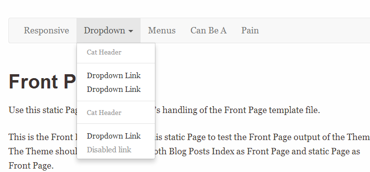
Demo Bootstrap 3 Responsive Menu
I must have a dropdown menu!
Fine, if you are going to add one I suggest using one with a community behind it. Usually you can hope that most of the accessibility and usability issues have already been hashed out. That is why for this example I went with Bootstrap 3’s Navigation Menu, this example shows what is required to get it to work with the Responsive Base Plus theme, but also provides links to do it with any WordPress Theme. You can also use this as a general idea of what is required to add any other type of menu system, like Foundation from Zurb.
This half-assed mini tutorial is based on removing the current responsive menu (with no dropdowns) from Responsive Base Plus, and replacing it with Bootstrap 3’s. Fair warning, this is pretty gross, the Sass can be heavily trimmed down to just what you need. I have removed all the code that doesn’t pertain to the menu, but there are so many different types of menu options, it is still a large chunk of code.
Modifying the WordPress Menu for Bootstrap
Luckily, someone was kind enough to have the Nav Walker already taken care of. You will need the wp-bootstrap-navwalker, download the file and save it to your child theme in the main directory /childtheme/wp_bootstrap_navwalker.php.
Now you will need to remove the old menu system from the functions.php in the child theme. Locate the current menu override childtheme_override_access and remove this function.
function childtheme_override_access() {
    ?>
    <div id="access" role="navigation">
        <a class="menu-toggle" href="#">Menu</a>
        <?php
        if ( ( function_exists( 'has_nav_menu' ) ) && ( has_nav_menu( apply_filters( 'thematic_primary_menu_id', 'primary-menu' ) ) ) ) {
            echo  wp_nav_menu(thematic_nav_menu_args());
        } else {
            echo  thematic_add_menuclass( wp_page_menu( thematic_page_menu_args () ) );
        }
        ?>
    </div><!-- #access -->
    <?php
}
Now replace that with the code provided below from the wp-bootstrap-navwalker documentation, but using an override provided by the Thematic theme (the parent theme).
function childtheme_override_access() {
    ?>
    <nav id="access" class="navbar navbar-default" role="navigation">
        <!-- Brand and toggle get grouped for better mobile display -->
            <div class="navbar-header">
                <button type="button" class="navbar-toggle" data-toggle="collapse" data-target="#bs-example-navbar-collapse-1">
                    <span class="sr-only">Navigation</span>
                    <span class="icon-bar"></span>
                    <span class="icon-bar"></span>
                    <span class="icon-bar"></span>
                </button>
                <a class="navbar-brand" href="#">
                    Menu
                </a>
            </div>
        <?php
            echo  wp_nav_menu(
                array(
                    'menu'              => 'mainNav',
                    'theme_location'    => 'mainNav',
                    'depth'             => 2,
                    'container'         => 'div',
                    'container_class'   => 'collapse navbar-collapse',
                    'container_id'      => 'bs-example-navbar-collapse-1',
                    'menu_class'        => 'nav navbar-nav',
                    'fallback_cb'       => 'wp_bootstrap_navwalker::fallback',
                    'walker'            => new wp_bootstrap_navwalker())
            );
        ?>
    </nav> <!-- #access .navbar -->
    <?php
}

register_nav_menus( array(
    'mainNav' => __( 'Dropdown Nav Menu', 'Dropdown Nav Menu' ),
) );

// Register Custom Navigation Walker
require_once('wp_bootstrap_navwalker.php');
The code above will add the correct structure for Bootstrap, add a new menu option in the WordPress admin called Dropdown Nav Menu and add (register it for use) the wp-bootstrap-navwalker.php file.
A couple of things to note, you will need to setup the menu ‘and’ add the correct menu location in your WordPress Admin. Both the wp-bootstrap-navwalker and Bootstrap 3 only support 1 level of dropdowns, so to do more… it will take some work. I haven’t looked into it yet.
Bootstrap’s JavaScript for Dropdown Menu
Locate the js/custom.js file provided in the child theme. Go ahead and delete the previous toggle for the default menu provided by Responsive Base Plus.
jQuery(document).ready(function($) {
    $('.menu-toggle').click(function(e) {
        $('.menu-toggle').toggleClass('toggled');
        $('.menu').toggleClass('active');
    });
});
Unless you have added custom code to your child theme, there won’t be anything in the file any longer. In that same file, add the code from this Github Gist.
Download Bootsrap JavaScript Code
This is required for the dropdown, it includes the dropdown.js, collapse.js and transition.js files. The files are on a Gist so this post doesn’t look painfully long.
Bootstrap’s CSS for Dropdown Menu
Hopefully you are using Sass, but even if you aren’t, I will provide the compiled CSS. This is the part that gets gross, the problem is the Bootsrap menu is super flexible and is capable of having a lot of different styles and formats. I have trimmed it down to what is just required for the menu, but it is still a lot. If you were using this in production, I would highly suggest removing all the menu features that aren’t being used.
If using Sass
Awesome, you are using Sass, this is fairly easy. Locate the /scss/ folder in the child theme, then open up the _navigation-main-menu.scss file. You can safely delete what is there since you are replacing that default menu. Then just drop in the code from this Github Gist.
When you see that super gross amount of Sass and are unfamiliar with Bootsrap, you will probably be a little bummed… it does take a bit of messing with things to get a grasp on it. It is doable though.
If using just boring ass CSS
Shame on you, learn Sass sooner than later. Now, to do this with CSS, you will need to find the comment in the style.css that looks like this.
/* navigation main menu
   ========================================================================== */
You are going to want to delete all the previous code that is there for the old menu system, don’t delete anything after the next CSS comment “navigation, buttons and forms”. Now just drop in the code from this Github Gist.
The CSS isn’t as crazy looking as the Sass, but it is still massive.
Pray it works.
Hopefully everything went smoothly. Remember those few small chunks of code you removed to add these massive Bootsrap chunks? Yeah, that is why I didn’t add dropdown menu functionality. What would be even worse is if I did add it, and you had to remove all that cruft just to put in something simple.