Categories
Posts

Placement of Media Queries

While going through a redesign of my website, I forced myself to place the media queries inside each #id and .class using Sass, instead of at the bottom in a huge clump. The idea of this isn’t something new and if you are using gzip there are no performance drawbacks. I just couldn’t visualize why having media queries spread all through the document would be better than having them in a nice organized block at the bottom of the CSS.

Using Sass and a mixin does make adding media queries easier, I adopted using Chris Coyier’s handy Sass Breakpoint mixin. The one thing I wasn’t crazy about was the mixin was not a mobile first setup, so I modified it because once you start setting up your code to be a mobile first structure, you won’t ever go back.

It wasn’t long before I needed a custom breakpoint and again modified it. The concept of being able to add a custom breakpoint of any value whenever you need one is very refreshing, best summed up by Stephen Hay.

Start with the small screen first, then expand until it looks like shit. Time to insert a breakpoint!

The revelation of not being so bound to predefined media query breakpoints is very powerful and adding them in the class they pertain to ended up being better for organization.

The most important thing is the Sass mixin increased my overall workflow speed, especially when combined with a SublimeText snippet, which is probably the greatest benefit.

Sass Media Query Breakpoint Mixin


@mixin breakpoint($point) {
    @if $point == medium {
        @media (min-width: 30em)  { @content; }
    }
    @else if $point == large {
        @media (min-width: 50em) { @content; }
    }
    @else if $point { // allows custom breakpoints
        @media (min-width: $point) { @content; }
    }
}

Sass Breakpoint Usage


.content {
    // mobile-first styles here
    // the idea is styles here will work for mobile all the way to desktop
    // you then override the styles with the breakpoints below as things get more complex or additional functionality is needed

    @include breakpoint(medium) {
        // medium defined breakpoint styles
        // this is where you put styles that are applied to medium and large
    }
    @include breakpoint(large) {
        // large defined breakpoint styles
        // this is where you put styles that are only applied to large
    }
    @include breakpoint(80em) {
        // custom defined breakpoint styles
        // this is where you can add any value and create any additional media query you need
    }
}

Why Medium and Large?

Someone might wonder why I chose to use medium and large as breakpoints instead of only custom variations. It has to do with I like to have multiple things happen at the same time and felt safer to have things like the layout and fonts in media queries change at specific width, doing a custom width for everything is overkill, but having the option is awesome.

Yes, you can convert these to pixels if you haven’t made the leap into using em units for media queries.

Simple Breakpoint Example

This is a very simple example of changing the font size for the whole site as it scales up from mobile to desktop.


body {
    background: $background;
    font-family: $body-font;
    font-size: 100%;
    line-height: 1.625;
    color: $body-color;

    @include breakpoint(medium) {
        font-size: 112.5%;
    }
    @include breakpoint(large) {
        font-size: 125%;
    }
}

Update: Added Codepen demo to show an example.

SublimeText Breakpoint Snippet

Hopefully you are using SublimeText as a text editor, if so Chris Coyier posted a video showing usage of a Sublime Snippet by James Nowland so you can output the breakpoint by just typing “mq + Tab” (or “mq + Enter” if you use Enter instead of the Tab trigger like I do to avoid conflicts with Emmet).

This snippet has been modfied to use my version of the Sass Breakpoint Mixin above, which I prefer. Josh Hibbert mentioned in comments on the video that you can insert a tab trigger after the snippet to get the cursor to tab to a new line, small optimization but very handy.


<snippet>
    <content><![CDATA[
    @include breakpoint($1) {
        $2
    }
    $3
    ]]></content>
    
    <tabTrigger>mq</tabTrigger>
    <scope>source.css, source.scss</scope>
</snippet>
Categories
Posts

Thematic and Grid Systems

So you are wanting to add a grid system to the Thematic Theme Framework for WordPress. Grid systems make theme development super easy right? Not necessarily.

Occasionally a question will pop up on the forum involving incorporating a gird into Thematic. Most of the questions involve adding classes like grid_6, span-5 to the HTML Thematic outputs to add the styling for their framework of choice. You can do that by adding functions and filters to your functions.php file, but this is the wrong way to do it and causes a lot of code bloat.

Grids are suppose to make things easy, once you step into the realm of having to add classes to the existing markup to match whatever syntax the grid system is using, you are already making things harder than they need to be.

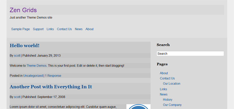
zen-grids-example

View Demo

This example is going to be a little complicated for some and super easy for others already familiar with Sass and Compass. If you don’t know what Sass and Compass are, watch this first for a little bit of a background. This post isn’t really a tutorial, but more of a visualization of how easy it can be to work with a grid system in Thematic. You will obviously need Sass and Compass for this to work.

The code is specifically set up for using the Responsive Base Theme I have created for Thematic and the grid system style I will be aiming for is the default Thematic layout.

Zen Grids and Thematic

Zen Grids is a responsive grid system built to work with Sass and Compass, in my opinion it is one of the easier ones out there to understand. You will have to most likely visit the Zen Grids site and follow the simple setup tutorials, once setup though, it is a breeze.

The first thing we need to do is import Zen Grids in the top of the style.scss file. If you are on PC and using Scout, there is no real setup, Zen Grids is built in, you need to change the import to just @import "zen";.


@import "zen-grids";

Next we need to set a couple Sass variables so the grid system knows how many columns we are using and the width of the gutters.


$zen-column-count: 12; // grid columns
$zen-gutter-width: 2em; // gutter width

Since the responsive base theme I have created is a “mobile-first” structure, all the base CSS is already set and only things that need to be changed are in the media queries. So we need to swap out the previous media queries at the bottom of the style.scss file with the new Zen Grids setup.


@media only screen and (min-width: 45em) {
    #wrapper {
        @include zen-grid-container;
        max-width: 1140px;
        margin: 0 auto;
    }
    #branding {
        @include zen-grid-item(12, 1);
        width: 100%;
    }
    #access .menu {
        @include zen-grid-item(12, 1);
        @include zen-clear(both);
        width: 100%;
    }
    #container { @include zen-grid-item(8, 1); }
    #main {
        @include pie-clearfix;
        width: 100%;
    }
    .main-aside { @include zen-grid-item(4, 1, right); }
    #secondary { @include zen-clear(right); }
    #subsidiary {
        @include pie-clearfix;
        width: 100%;
    }
    #first { @include zen-grid-item(4, 1); }
    #second { @include zen-grid-item(4, 5); }
    #third { @include zen-grid-item(4, 9); }
    #footer-widget { @include zen-grid-item(12, 1); }
    #siteinfo {
        @include zen-grid-item(12, 1);
        width: 100%;
    }
    blockquote {
        &.left {
            float: left;
            width: 33%;
            margin-left: 0;
            margin-right: 1.5em;
            text-align: right;
        }
        &.right {
            float: right;
            width: 33%;
            margin-left: 1.5em;
            margin-right: 0;
            text-align: left;
        }
    }
    .sf-menu li { float: left; }
    .content-column {
        float: left;
        width: 45%;
        margin: 0 0 1.625em;
    }
    .navigation {
        margin: 0 0 1.625em;
        overflow: hidden;
    }
    .nav-previous {
        float: left;
        width: 50%;
    }
    .nav-next {
        float: right;
        width: 50%;
        text-align: right;
    }
    .page-template-template-page-fullwidth-php #comments { @include zen-grid-flow-item( 8, 12); }
}

That is it, there is a little bit of extra markup in there for additional elements, but only because I wanted to recreate the exact same layout as the Responsive Base theme, but with the added benefit of Zen Grids.

If you need help understanding the code, I would recommend checking the Zen Grids help page which is well documented.

This is by no means the “optimized” way to add Zen Grids, there a a few things that can be done to cut the code down a bit and make things “DRY“, but the idea is to see a simple example of the power Sass and Compass can add to your projects. Keep in mind that a grid system is not always required, but if you are creating sites over and over it may be beneficial to your workflow.

With all that said, personally I have dropped playing with Zen Grids and focused my attention on another grid system that seems to be the best I have found so far, it is called Susy and if you are going to go the grid route, I highly suggest looking into it.

Update: This site is now built using Susy Grids, so far they are awesome.

Categories
Posts

Thematic and Icon Fonts

There are plenty of tutorials and oodles of information floating around about icon fonts, they are all the rage right now. There are awesome things achievable with icon fonts and they can provide a lot of flexibility in your development workflow. It seems some people get the impression that using fonts as icons is overly complicated, so my goal is to provide a few simple examples of using icon fonts with the Thematic Theme Framework for WordPress.

I am going to show you how to use fonts for icons the easiest way possible, then explain a even better way afterwards, but currently the goal is just to get you setup using icon fonts with your Thematic child themes. We are going to be using a handy little API from We Love Icon Fonts.

We Love Icon Fonts with WordPress

We are going to be using the Entypo set of icons for now, but you can swap these out later for a different set. The We Love Icon Fonts sites example uses an @import, while easier, I usually avoid using @import in stylehseets for performance reasons. So lets load that instead in the header as is best practice with any stylesheets when using WordPress.

Enqueue Icon Fonts Styles

This snippet will register and enqueue the weloveiconfonts.com API styes for use in the theme, this will work for any WordPress theme, not just Thematic. Just drop this into the functions.php of your child theme, or theme if you aren’t using a child.


// enqueue font icons
function childtheme_icon_fonts() {
    // registers weloveiconfonts.com icon font api styles
    wp_register_style('icon-fonts-css', 'http://weloveiconfonts.com/api/?family=entypo');
    // enqueue the scripts for use in theme
    wp_enqueue_style ('icon-fonts-css');
}
add_action('wp_enqueue_scripts', 'childtheme_icon_fonts');

Required CSS to call Icon Fonts

Just drop this CSS in your style sheet.


[class*="entypo-"]:before { font-family: 'entypo', sans-serif; }

That’s it. Now all that is needed is to add a specific class with a name on the element to call the icon, for example .icon-home.

The CSS included in the demos is very basic, they are styled with just enough structure to get you started on making them your own. The demos were set up in Sass, so if you prefer that you can grab it off the SCSS section tab in the demo.

Social Icon Font Example

Check out this Pen!

One of the most popular uses is social icons, sure you can use images, but icon fonts are cooler. This is a basic setup using Thematic’s existing structure for providing a few links to your social networks in the sidebar. :)

Social Icon Font PHP

This snippet will go in the functions.php of the child theme. We are using some existing CSS classes to keep the same structure from Thematic to keep things uniform in the sidebar, hooking the function on to the thematic_belowmainasides hook.


function childtheme_social_icon_fonts() { ?>
    <div id="tertiary" class="aside main-aside">
        <ul class="xoxo social-icons">
          <li><a class="entypo-twitter" href="#" title="Twitter"><span>Twitter</span></a></li>
          <li><a class="entypo-facebook" href="#" title="Facebook"><span>Facebook</span></a></li>
          <li><a class="entypo-github" href="#" title="Github"><span>Github</span></a></li>
          <li><a class="entypo-rss" href="#" title="RSS"><span>RSS</span></a></li>
        </ul>
    </div>
<?php }
add_action('thematic_belowmainasides', 'childtheme_social_icon_fonts');

Social Icon Font CSS


#tertiary { clear: right; }
.social-icons { list-style: none; }
.social-icons li { float: left; }
.social-icons li a {
    padding: 0 0.5em;
    font-size: 2em;
    text-decoration: none;
    text-shadow: 
        1px 1px 0 rgba(0, 0, 0, 0.4), 
        1px 1px 2px rgba(0, 0, 0, 0.4);
}
.social-icons li a:hover {
    text-shadow: 
        1px 1px 0 rgba(0, 0, 0, 0.6), 
        1px 1px 4px rgba(0, 0, 0, 0.4);
}
.social-icons span { display: none; }

This example uses Twitter, Facebook, Github and RSS, the actual text will be hidden, using the icons only, but it is good practice to include it anyway.

WordPress Menu Font Icons

Check out this Pen!

Inserting font icons in the WordPress menu is pretty easy, the way to do it is to add a class through the WordPress Admin built in Custom Menu functionality. There is a section “CSS Classes” where you can add the icon class you want, if you don’t see this option in the menus, check the “Screen Options” in the right top and check that option to show. Since the classes are added through WP itself, there is no additional PHP needed.

WordPress Menu Font Icons CSS


.sf-menu [class*="entypo-"]:before {
    z-index: 3;
    position: absolute;
    top: 5px;
    left: 5px;
    font-size: 24px;
    color: #666666;
    text-shadow: 
        1px 1px 0 rgba(0, 0, 0, 0.4), 
        1px 1px 2px rgba(0, 0, 0, 0.4);
    cursor: pointer;
}
.sf-menu [class*="entypo-"]:hover:before {
    color: #FF4B33;
    text-shadow: 
        1px 1px 0 rgba(0, 0, 0, 0.6), 
        1px 1px 4px rgba(0, 0, 0, 0.4);
}
.sf-menu [class*="entypo-"] a { padding: 9px 13px 9px 38px; }
.sf-menu [class*="entypo-"] li a { padding: 9px 13px; }

Just don’t forget you need to add the classes through the WP Admin Menu.

Navigational Font Icons

Check out this Pen!

Thematic by default has two separate navigation structures, one is for navigating the Older/Newer posts and the other is on single post pages that show the title of the previous and next post. Most sites I work on do not include the navigation on the single posts. This example removes the single post page navigation and instead replaces the standard Older/Newer navigation in WordPress with some font icons to replace the default text.

Navigational Font Icons PHP

The first function completely removes the upper navigation (personal preference), instead we are only going to be using the lower navigation. The second function removes the navigation on single pages and changes the structure to give some better hooks for adding some font icons arrows instead. I also added a title in since there is no text, at least the title “Older posts” or “Newer posts” will show on hover, which is helpful.


// override nav_below functionality - remove it completely
function childtheme_override_nav_above() {
    // silence
}

// override nav_below functionality
function childtheme_override_nav_below() {
    if ( !is_single() ) { ?>
        <div id="nav-below" class="navigation">
            <div class="nav-previous"><?php next_posts_link('<i title="Older posts" class="entypo-left"></i> <span>Older posts</span>') ?></div>
            <div class="nav-next"><?php previous_posts_link('<span>Newer posts</span> <i title="Newer posts" class="entypo-right"></i>') ?></div>
        </div> <?php
    }
}

Navigational Font Icons CSS


.navigation {
    margin: 0 0 1.625em;
    overflow: hidden;
}
.navigation a {
    display: block;
    height: 5em;
    width: 5em;
    line-height: 5em;
    text-align: center;
    background: rgba(0, 0, 0, 0.2);
    border-radius: 50%;
}
.navigation i {
    font-size: 5em;
    color: #666666;
    font-style: normal;
}
.navigation .nav-previous {
    float: left;
    width: auto;
}
.navigation .nav-next {
    float: right;
    width: auto;
}
.navigation span { display: none; }

Now the kicker.

While this is a viable way to achieve font icons and is usable, there is a better way to do this if you are trying to keep everything optimized (as fast as possible). The idea is instead of letting We Love Icon Fonts handle the loading of the fonts, you instead use a service to trim down the fonts to exactly what you need, so you load 4 icons in the font instead of 40 and handle the serving of the font files yourself. There are some great services out there like IcoMoon and Fontello which make it a breeze. So hopefully this gives you a leg up on using font icons with Thematic.

A few complex examples.

Categories
Random

Baby Under Construction

Tinkering with using CSS box shadows to create an image with 1 single HTML div element. This idea for what I created comes from a lazyweb request for the famous “Website Under Construction” GIF, but reproduced with just CSS.

It is super easy, just a little tedious, the idea is you can essentially make little “dots” with box-shadows, it is not exactly practical to do things like this, but it is a fun exercise just knowing how to do it.

Single Element HTML

<div class="construction"></div>

CSS, well technically SCSS

body { padding: 2em; }
.construction {
    animation: work 1s steps(1, start) infinite;
    position: relative;
    height: 1em;
    width: 1em;
    margin-bottom: 37em;
    margin-left: 17em;
    font-size: 7px;
    &:before {
        @include rotate(45deg);
        z-index: -1;
        position: absolute;
        top: 5em;
        left: -12em;
        height: 28em;
        width: 28em;
        content: '';
        background-color: #fdd400;
        border-radius: 3em;
    }
    &:after {
        content: '';
        position: absolute;
        left: -17em;
        height: 1em;
        width: 1em;
        margin-left: 17em;
        background-color: #000;
        box-shadow:

            /* static parts */

            /* the sign border */

            /* row 1 */
            1em 0em,
            2em 0em,
            3em 0em,
            /* row 2 */
            -1em 1em,
            0em 1em,
            1em 1em,
            2em 1em,
            3em 1em,
            4em 1em,
            /* row 3 */
            -2em 2em,
            -1em 2em,
            4em 2em,
            5em 2em,
            /* row 4 */
            -3em 3em,
            -2em 3em,
            5em 3em,
            6em 3em,
            /* row 5 */
            -4em 4em,
            -3em 4em,
            6em 4em,
            7em 4em,
            /* row 6 */
            -5em 5em,
            -4em 5em,
            7em 5em,
            8em 5em,
            /* row 7 */
            -6em 6em,
            -5em 6em,
            8em 6em,
            9em 6em,
            /* row */
            -7em 7em,
            -6em 7em,
            9em 7em,
            10em 7em,
            /* row 9 */
            -8em 8em,
            -7em 8em,
            10em 8em,
            11em 8em,
            /* row 10 */
            -9em 9em,
            -8em 9em,
            11em 9em,
            12em 9em,
            /* row 11 */
            -10em 10em,
            -9em 10em,
            12em 10em,
            13em 10em,
            /* row 12 */
            -11em 11em,
            -10em 11em,
            13em 11em,
            14em 11em,
            /* row 13 */
            -12em 12em,
            -11em 12em,
            14em 12em,
            15em 12em,
            /* row 14 */
            -13em 13em,
            -12em 13em,
            15em 13em,
            16em 13em,
            /* row 15 */
            -14em 14em,
            -13em 14em,
            16em 14em,
            17em 14em,
            /* row 16 */
            -15em 15em,
            -14em 15em,
            17em 15em,
            18em 15em,
            /* row 17 */
            -16em 16em,
            -15em 16em,
            18em 16em,
            19em 16em,
            /* row 18 */
            -17em 17em,
            -16em 17em,
            19em 17em,
            20em 17em,
            /* row 19 */
            -17em 18em,
            -16em 18em,
            19em 18em,
            20em 18em,
            /* row 20 */
            -17em 19em,
            -16em 19em,
            19em 19em,
            20em 19em,
            /* row 21 */
            -17em 20em,
            -16em 20em,
            19em 20em,
            20em 20em,
            /* row 22 */
            -16em 21em,
            -15em 21em,
            18em 21em,
            19em 21em,
            /* row 23 */
            -15em 22em,
            -14em 22em,
            17em 22em,
            18em 22em,
            /* row 24 */
            -14em 23em,
            -13em 23em,
            16em 23em,
            17em 23em,
            /* row 25 */
            -13em 24em,
            -12em 24em,
            15em 24em,
            16em 24em,
            /* row 26 */
            -12em 25em,
            -11em 25em,
            14em 25em,
            15em 25em,
            /* row 27 */
            -11em 26em,
            -10em 26em,
            13em 26em,
            14em 26em,
            /* row 28 */
            -10em 27em,
            -9em 27em,
             12em 27em,
             13em 27em,
            /* row 29 */
            -9em 28em,
            -8em 28em,
            11em 28em,
            12em 28em,
            /* row 30 */
            -8em 29em,
            -7em 29em,
            10em 29em,
            11em 29em,
            /* row 31 */
            -7em 30em,
            -6em 30em,
            9em 30em,
            10em 30em,
            /* row 32 */
            -6em 31em,
            -5em 31em,
            8em 31em,
            9em 31em,
            /* row 33 */
            -5em 32em,
            -4em 32em,
            7em 32em,
            8em 32em,
            /* row 34 */
            -4em 33em,
            -3em 33em,
            6em 33em,
            7em 33em,
            /* row 35 */
            -3em 34em,
            -2em 34em,
            5em 34em,
            6em 34em,
            /* row 36 */
            -2em 35em,
            -1em 35em,
            4em 35em,
            5em 35em,
            /* row 37 */
            -1em 36em,
            0em 36em,
            1em 36em,
            2em 36em,
            3em 36em,
            4em 36em,
            /* row 38 */
            0em 37em,
            1em 37em,
            2em 37em,
            3em 37em,

            /* header (head) */

            /* row 8 */
            -3em 7em,
            -2em 7em,
            -1em 7em,
            0em 7em,
            /* row 9 */
            -4em 8em,
            -3em 8em,
            -2em 8em,
            -1em 8em,
            0em 8em,
            1em 8em,
            /* row 10 */
            -4em 9em,
            -3em 9em,
            -2em 9em,
            -1em 9em,
            0em 9em,
            1em 9em,
            /* row 11 */
            -4em 10em,
            -3em 10em,
            -2em 10em,
            -1em 10em,
            0em 10em,
            1em 10em,
            /* row 12 */
            -4em 11em,
            -3em 11em,
            -2em 11em,
            -1em 11em,
            0em 11em,
            1em 11em,
            /* row 13 */
            -3em 12em,
            -2em 12em,
            -1em 12em,
            0em 12em,

            /* body (body) */

            /* row 15 */
            -3em 14em,
            -2em 14em,
            -1em 14em,
            0em 14em,
            /* row 16 */
            -4em 15em,
            -3em 15em,
            -2em 15em,
            -1em 15em,
            0em 15em,
            1em 15em,
            /* row 17 */
            -4em 16em,
            -3em 16em,
            -2em 16em,
            -1em 16em,
            0em 16em,
            1em 16em,
            /* row 18 */
            -4em 17em,
            -3em 17em,
            -2em 17em,
            -1em 17em,
            0em 17em,
            1em 17em,
            /* row 19 */
            -4em 18em,
            -3em 18em,
            -2em 18em,
            -1em 18em,
            0em 18em,
            1em 18em,
            /* row 20 */
            -4em 19em,
            -3em 19em,
            -2em 19em,
            -1em 19em,
            0em 19em,
            1em 19em,
            /* row 21 */
            -4em 20em,
            -3em 20em,
            -2em 20em,
            -1em 20em,
            0em 20em,
            1em 20em,
            /* row 22 */
            -4em 21em,
            -3em 21em,
            -2em 21em,
            -1em 21em,
            0em 21em,
            1em 21em,
            /* row 23 */
            -4em 22em,
            -3em 22em,
            -2em 22em,
            -1em 22em,
            0em 22em,
            1em 22em,
            /* row 24 */
            -4em 23em,
            -3em 23em,
            -2em 23em,
            -1em 23em,
            0em 23em,
            1em 23em;
    }
}

/* baby making animation */

@keyframes work {
    50% {
        box-shadow:

        /* sidebar (arms) ***********************************/

        2em 15em,
        2em 16em,
        3em 16em,
        3em 17em,
        4em 17em,
        4em 18em,
        5em 18em,
        5em 19em,
        6em 19em,
        6em 20em,
        7em 20em,
        7em 21em,
        8em 21em,
        8em 22em,
        9em 22em,

        /* footer (legs) ***********************************/

        /* row 26 */
        -4em 25em,
        -3em 25em,
        -2em 25em,
        -1em 25em,
        0em 25em,
        1em 25em,
        /* row 27 */
        -4em 26em,
        -3em 26em,
        -2em 26em,
        -1em 26em,
        0em 26em,
        1em 26em,
        /* row 28 */
        -4em 27em,
        -3em 27em,
        -2em 27em,
        -1em 27em,
        0em 27em,
        1em 27em,

        /* peepee (wiener) ***********************************/

        2em 27em,
        3em 27em,
        4em 27em,
        5em 27em,

        /* row 29 */
        -4em 28em,
        -3em 28em,
        -2em 28em,
        -1em 28em,
        0em 28em,
        1em 28em,
        /* row 30 */
        -3em 29em,
        -2em 29em,
        -1em 29em,
        0em 29em,
        1em 29em,
        /* row 31 */
        -3em 30em,
        -2em 30em,
        -1em 30em,
        0em 30em,
        1em 30em,
        /* row 32 */
        -3em 31em,
        -2em 31em,
        -1em 31em,
        0em 31em,
        1em 31em,
        /* row 33 */
        -3em 32em,
        -2em 32em,
        -1em 32em,
        0em 32em,
        1em 32em,
        /* row 34 */
        -3em 33em,
        -2em 33em,
        -1em 33em,
        0em 33em,
        1em 33em,
        /* row 35 */
        -3em 34em,
        -2em 34em,
        -1em 34em,
        0em 34em,
        1em 34em,
        /* row 36 */

        -2em 35em,
        -1em 35em,
        0em 35em,
        1em 35em,

        /* partner (receiver) ***********************************/

        /* row 24 */
        7em 23em,
        8em 23em,
        9em 23em,
        10em 23em,
        11em 23em,
        12em 23em,
        13em 23em,
        14em 23em,
        15em 23em,
        /* row 25 */
        6em 24em,
        7em 24em,
        8em 24em,
        9em 24em,
        10em 24em,
        11em 24em,
        12em 24em,
        13em 24em,
        14em 24em,
        /* row 26 */
        6em 25em,
        7em 25em,
        8em 25em,
        9em 25em,
        10em 25em,
        11em 25em,
        12em 25em,
        13em 25em,
        /* row 27 */
        6em 26em,
        7em 26em,
        8em 26em,
        9em 26em,
        10em 26em,
        11em 26em,
        12em 26em,
        /* row 28 */
        6em 27em,
        7em 27em,
        8em 27em,
        9em 27em,
        10em 27em,
        11em 27em,
        /* row 29 */
        6em 28em,
        7em 28em,
        8em 28em,
        9em 28em,
        10em 28em,
        /* row 30 */
        7em 29em,
        8em 29em,
        9em 29em,
        /* row 31 */
        8em 30em;
    }
    100% {
        box-shadow:

        /* sidebar (arms) ***********************************/

        1em 15em,
        1em 16em,
        1em 17em,
        2em 17em,
        2em 18em,
        3em 18em,
        3em 19em,
        4em 19em,
        4em 20em,
        5em 20em,
        5em 21em,
        6em 21em,
        6em 22em,
        7em 22em,

        /* footer (legs) ***********************************/

        /* row 26 */
        -3em 25em,
        -2em 25em,
        -1em 25em,
        0em 25em,
        1em 25em,
        2em 25em,
        /* row 27 */
        -3em 26em,
        -2em 26em,
        -1em 26em,
        0em 26em,
        1em 26em,
        2em 26em,
        /* row 28 */
        -3em 27em,
        -2em 27em,
        -1em 27em,
        0em 27em,
        1em 27em,
        2em 27em,

        /* peepee (wiener) ***********************************/

        2em 27em,
        3em 27em,
        4em 27em,
        5em 27em,
        6em 27em,

        /* row 29 */
        -3em 28em,
        -2em 28em,
        -1em 28em,
        0em 28em,
        1em 28em,
        2em 28em,
        /* row 30 */
        -2em 29em,
        -1em 29em,
        0em 29em,
        1em 29em,
        2em 29em,
        /* row 31 */
        -2em 30em,
        -1em 30em,
        0em 30em,
        1em 30em,
        2em 30em,
        /* row 32 */
        -2em 31em,
        -1em 31em,
        0em 31em,
        1em 31em,
        2em 31em,
        /* row 33 */
        -2em 32em,
        -1em 32em,
        0em 32em,
        1em 32em,
        2em 32em,
        /* row 34 */
        -2em 33em,
        -1em 33em,
        0em 33em,
        1em 33em,
        2em 33em,
        /* row 35 */
        -1em 34em,
        0em 34em,
        1em 34em,
        2em 34em,
        /* row 36 */
        -2em 35em,
        -1em 35em,
        0em 35em,
        1em 35em,
        2em 35em,

        /* partner (receiver) ***********************************/

        /* row 24 */
        5em 23em,
        6em 23em,
        7em 23em,
        8em 23em,
        9em 23em,
        10em 23em,
        11em 23em,
        12em 23em,
        13em 23em,
        14em 23em,
        15em 23em,
        /* row 25 */
        4em 24em,
        5em 24em,
        6em 24em,
        7em 24em,
        8em 24em,
        9em 24em,
        10em 24em,
        11em 24em,
        12em 24em,
        13em 24em,
        14em 24em,
        /* row 26 */
        4em 25em,
        5em 25em,
        6em 25em,
        7em 25em,
        8em 25em,
        9em 25em,
        10em 25em,
        11em 25em,
        12em 25em,
        13em 25em,
        /* row 27 */
        4em 26em,
        5em 26em,
        6em 26em,
        7em 26em,
        8em 26em,
        9em 26em,
        10em 26em,
        11em 26em,
        12em 26em,
        /* row 28 */
        4em 27em,
        5em 27em,
        6em 27em,
        7em 27em,
        8em 27em,
        9em 27em,
        /* row 29 */
        4em 28em,
        5em 28em,
        6em 28em,
        7em 28em,
        8em 28em,
        9em 28em,
        /* row 30 */
        5em 29em,
        6em 29em,
        7em 29em,
        8em 29em,
        9em 29em,
        /* row 31 */
        6em 30em,
        7em 30em,
        8em 30em,
        /* row 32 */
        6em 31em,
        7em 31em,
        8em 31em,
        /* row 32 */
        6em 32em,
        7em 32em,
        8em 32em;
    }
}

The Result

Something only a mother could be proud of.

I was able to get the man, the myth, the legend to tweet me back. Achievement unlocked. ;)

Categories
Posts

Clearfix Clarity

When helping other designers and developers who are learning, the same basic issues come up quite often. One question that always seems to come up is the dreaded Float Collapse. Simply, the parent element will collapse and have no height if the child elements are all floated. Most of the time it isn’t noticeable, although you will notice when you want a background image on the parent element to be visible.

Float Collapse Issue Image

I am not going to explain how floats work, it is summed up very well by CSS Tricks. I am instead going to explain scenarios I was doing that just were over complicating a simple issue and show how I do things now. This post is primarily for referring people who are having the same issue, I often see people making the same mistakes.

When working with the Thematic Framework for WordPress I would run into the issue of float collapse while working with background images sliced from PSD’s. Fixing that is easy, the are multiple ways to do it, often a overflow: hidden; will fix it, but sometimes you need the good ole trusty CSS “clearfix”.

The CSS to make it work.

The CSS for the clearfix is simple, I usually choose to use the micro clearfix hack created by Nicolas Gallagher.


.cf:before, .cf:after { content: " ";  display: table; }
.cf:after { clear: both; }
.cf { *zoom: 1; }

The CSS above makes it seem like you have to add a class to perform the clearfix, so all you have to do is add a class of .cf and boom fixed!

Well…. the key is you don’t have to add a class or any additional HTML markup at all. The goal is to not add anything to the HTML markup that isn’t required, especially something in the styling realm like a CSS clearfix.

Friends don’t let friends clearfix like this.

A long time ago I decided I would use jQuery to add the class of .cf to the parent sections that needed it, simple.


jQuery("#main").addClass('cf');

The problem is this relies on jQuery and it takes a little time to load so there would be a flash of unstyled content, albeit most of the time it was barely noticeable, it still bugged me.

Instead of using jQuery, I opted to go the route of adding the .cf class to the sections where needed.


<div id="main" class="cf"></div>

Or if not possible, adding a completely new element with a clearing class, clear: both; to essentially clear the floats which also works to remedy the float collapse.


<br class="clear">

While better in terms of performance, fixing the FOUC, this was now polluting the structure of the actual HTML site with unneeded markup.

How I clearfix now.

I will be the first to admit, I felt pretty stupid when I figured out there is no need to add a new class at all. Instead, just change the CSS on the clearfix to the existing ID/class.


#main:before, #main:after { content: " ";  display: table; }
#main:after { clear: both; }
#main { *zoom: 1; }

Much better and no need to add additional markup to the HTML structure.

If you are a bad ass and use Sass/Compass in your working environment, it is even easier to add letting the preprocessor handle the output.


#main { @include pie-clearfix; }

So hopefully I never see you using another clearfix class in the actual HTML again. This same thing of not adding unnecessary classes applies to grid frameworks, in the same exact way, but that is another blog post.