Update: Thematic 2.0 is now in beta and available on Github, which makes this theme outdated. You can still use it since Thematic is backwards compatible, but if you want to be up to date, use Thematic 2.0 from Github and Responsive Base Plus.
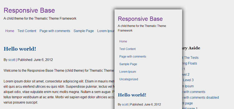
Responsive Base is a child theme built on the mobile-first approach to responsive web design. It was created not to just be responsive, but to act as a template or starting point for child theme development for the Thematic Theme Framework.
After creating quite a few Thematic based sites, I felt I needed a solid base starting point which saves a little time by being already set up with some very useful modifications I frequently use.
Responsive Base is ideal for me, I created it for me. Although others working with responsive themes for Thematic will find it useful and refreshing. It is intended to work best with the latest version of Thematic, but works fine on 9.7.7 and above.
Download Responsive Base Theme
View the demo to take a peek, or visit GitHub to download or view the code. Special thanks to Kathy for inspiration from her adaptive layouts for Thematic.
Responsive Base Highlights
The CSS
Thematic has a great minimalistic style by default, but I prefer not to have those default styles at the start of every child theme.
- The reset.css has been replaced by normalize.css which preserves the browser defaults and also corrects common browser inconsistencies.
- Original style sheets have had a ton of the unnecessary styles removed and condensed, while also building everything with a mobile first approach to responsive web design.
- Added HTML5Boilerplate print styles for clean printing and HTML5Boilerplate helper classes to take advantage of the latest best practices for things like clear fixes and image replacement.
The Functions PHP
- Adds my snippet to add conditional classes for Thematic to the header to target old versions of IE. This also now adds the
meta viewportfor correct scaling on mobile devices. By default this responsive theme will display a static mobile version with a little CSS for IE7 and IE8 based on a post by Joni Korpi called leaving old IE behind. - Includes a few functions to clean up the
headof the document of lines of code that are loaded by default. - Helps optimize script loading in WordPress by providing a template to promote good habits. Combining scripts, loading custom scripts in a custom.js file instead of on page and loading scripts in the footer unless they are required to load in the header.
- Loads Modernizr which includes the html5shiv for getting IE to recognize new HTML5 elements, also Modernizr does a ton more, especially useful for providing CSS3 fallbacks. Responsive Base child theme comes bundled with the full version of Modernizr, you should however use the build script to only include what you need.
- Loads FitVids JavaScript which handles the resizing of videos for responsive websites.
- Also provides a bunch of handy functions I tend to use on most child theme builds. Such as PHP snippets to add a Favicon, register additional menus in WordPress, a fourth subsidiary widget (good for footer menus), optimized Google Analytics and also a snippet to hide widget locations in the admin area.
Responsive Base File Structure
Includes necessary folders and files already setup in the child theme to promote well structured themes.
- /images/
- /js/
- custom.js
- jquery.fitvids.js
- modernizr.js
- favicon.ico
- functions.php
- screenshot.png
- style.css
- style.scss (for Sass/Compass)
Last Thoughts
While this theme is intended for developers to dive right in to responsive design with Thematic, it would also help people who are new to child themes get an idea on how things can be done in a clean and efficient way. Getting started in mobile-first responsive design can be rough at first, so hopefully you find this child theme template useful and be sure to always get the latest version or fork your own from GitHub.
Feel free to post your creations with the Responsive Base child theme in the comments, or if you think of anything to add, shoot me a pull request on GitHub. :)
Update: Now made to comply to with Idiomatic-CSS guidelines and also added a style.scss file for a basic Sass structure which also follows the guidelines. If you don’t use Sass, delete the style.scss file.
Update: Now works with the Thematic HTML5 Plugin by Karin at invistruct.com.

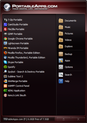
 Portableapps.com is a free resource which allows you to use free/open source applications such as web browsers, email applications, and a bunch of other useful tools.